
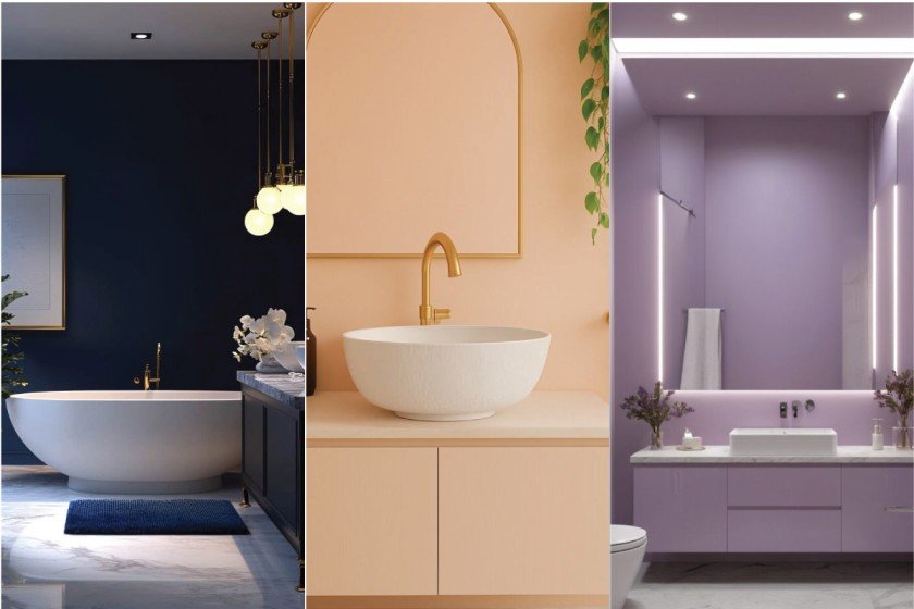
Color has a quiet way of shaping how a room feels, especially a space you use every day. As we move into 2025, refreshing your bathroom with current paint shades can shift the atmosphere without major changes. This year’s palette leans into soft earth tones, gentle greens, warm clay touches, and light neutrals that create a steady, soothing mood. Whether your bathroom is compact or spacious, these shades help it feel grounded, calm, and welcoming.
1. Serene Sage Bathroom Paint

Serene Sage brings a soft, grounded feel to a bathroom without overwhelming the space. It sits gently between green and gray, offering a calm mood that works well in small and large rooms alike. This shade pairs easily with light wood, brushed brass fixtures, or matte black accents, giving you flexibility in style.
To keep the space feeling open, use Serene Sage on the walls and balance it with white or cream towels and simple accessories. The color creates a steady backdrop that supports relaxation and clarity—ideal for morning routines or quiet evening wind-downs.
Serene Sage offers a subtle sense of peace and warmth, making the bathroom feel composed, refreshed, and quietly inviting.
2. Coastal Blue Bathroom Paint
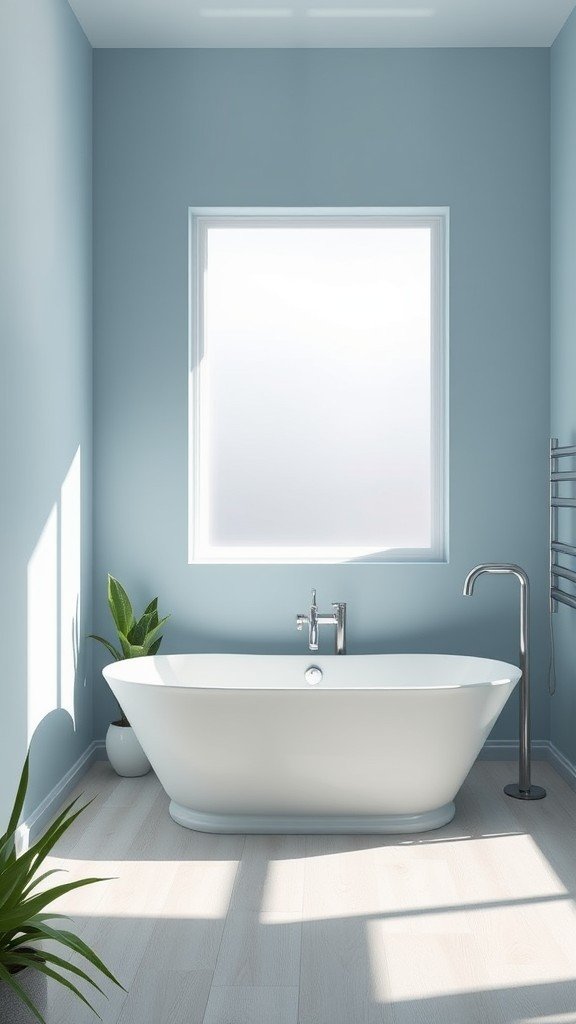
Coastal Blue brings a cool, easy atmosphere to a bathroom without feeling heavy. Its soft depth adds color while still keeping the space open and light. This shade pairs well with natural textures—think woven baskets, pale wood, or simple stone accents.
To keep the look steady, use white or cream trim and minimal décor. A single plant or a clean-lined mirror is enough. Coastal Blue encourages a calm, unhurried mood, making everyday routines feel a bit more grounded and clear.
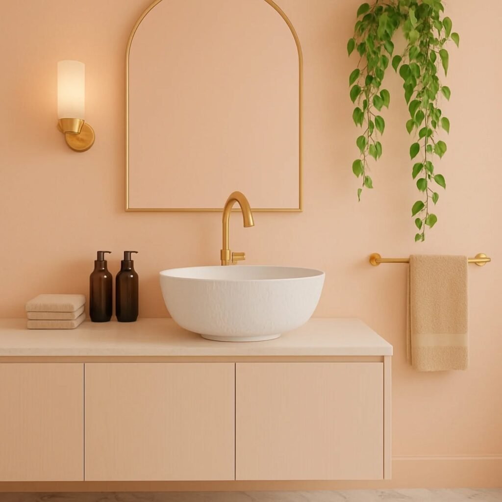
3. Soft Coral Bathroom Paint
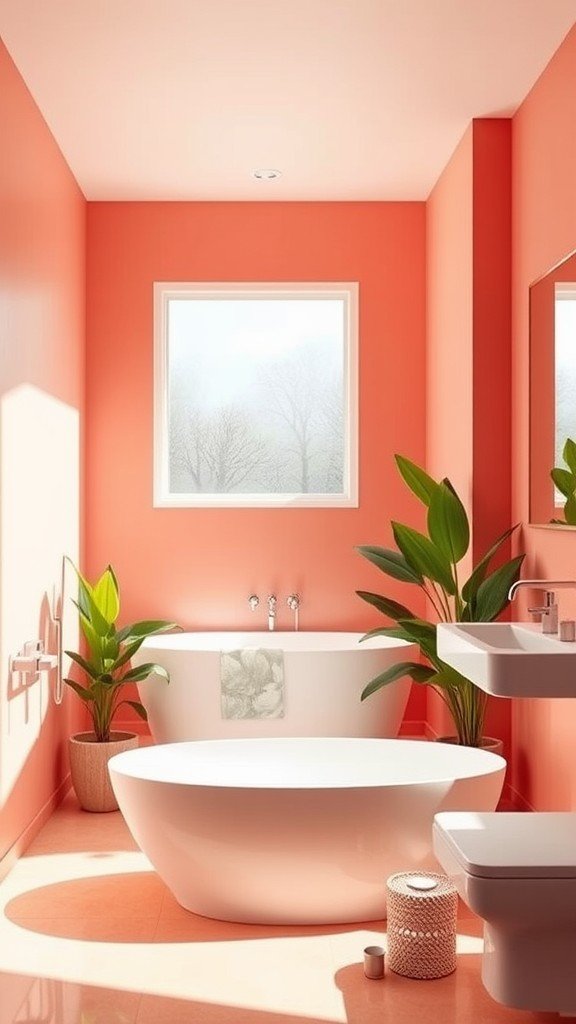
Soft Coral brings a warm, gentle glow to a bathroom without feeling bold or overwhelming. It sits quietly between peach and muted rose, adding a touch of comfort that feels inviting. This shade works well with simple white tile, natural wood accents, or brushed metal finishes, giving you room to style it in different directions.
Keep the décor modest to let the color speak on its own. Neutral towels, a clean mirror shape, and one subtle plant can complete the look. Soft Coral encourages a calm, lived-in atmosphere—easy, warm, and welcoming.
4. Elegant Charcoal Bathroom Paint
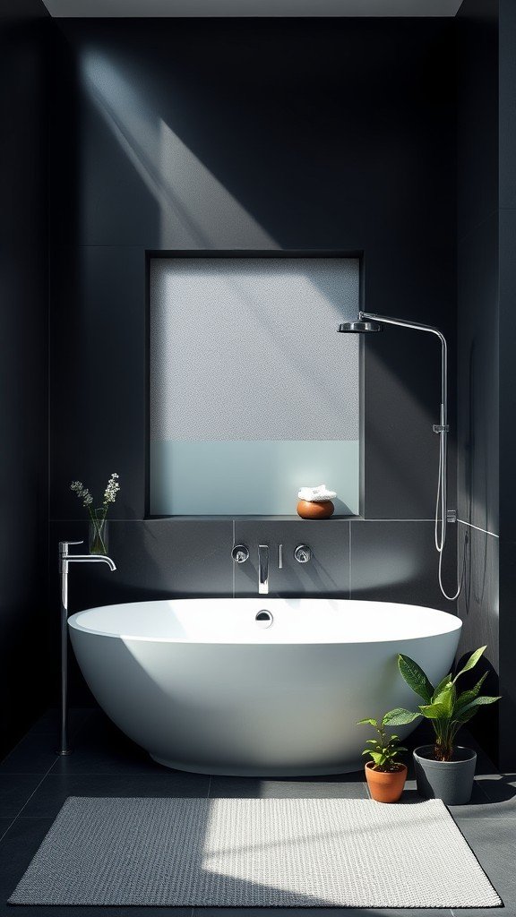
Elegant Charcoal introduces depth without making the room feel closed in. Its smooth, muted tone offers a grounded backdrop that works well with simple shapes and clean lines. This color pairs nicely with warm metal fixtures, soft white towels, and natural wood elements, giving the space a steady and refined feel.
Use it on one feature wall or across the entire room depending on how bold you want the atmosphere to be. Keep accents minimal to let the shade create a quiet sense of presence—subtle, calm, and thoughtfully composed.
5. Classic White Bathroom Paint
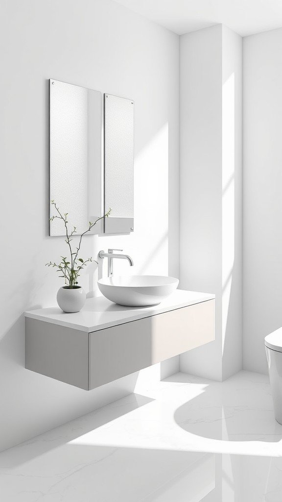
Classic White brings a clean, open feeling to a bathroom, making even smaller spaces appear lighter and more settled. It creates a quiet backdrop that lets you style the room in many directions—whether you lean modern, cozy, or somewhere in between. The shade works easily with natural wood, soft linens, or sleek metal fixtures, giving the space a calm, steady presence.
To keep it from feeling too plain, add subtle texture: a waffle towel, a woven basket, or a matte-finish tile. These small touches bring depth without overwhelming the room. Classic White offers a clear, gentle starting point—simple, airy, and easy to live with.
6. Earthy Taupe Bathroom Paint
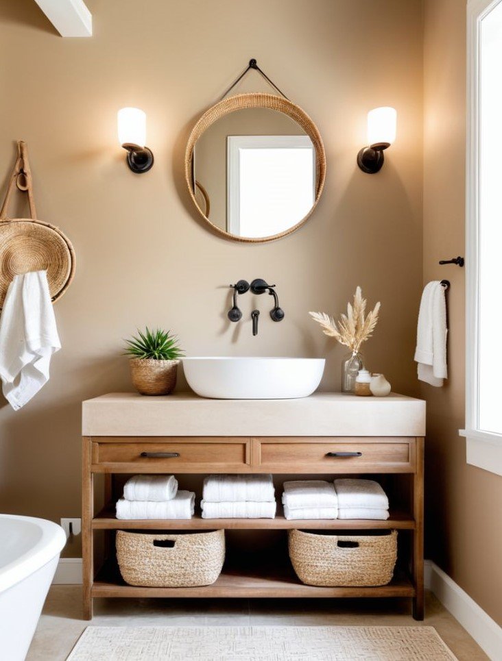
Earthy Taupe brings a warm, grounded feel to a bathroom without leaning too dark or too pale. It sits comfortably between soft brown and muted gray, creating a steady backdrop that feels easy to live with. This shade works well with natural wood shelves, matte black hardware, or brushed metal accents, offering flexibility without demanding attention.
To keep the space balanced, pair Earthy Taupe with light towels and simple decor. A clean mirror shape, a small plant, or a textured bath mat can add quiet character. The result is a bathroom that feels settled, warm, and welcoming—subtle and steady, without crowding the senses.
7. Dusty Rose Aesthetic Magic

Embrace the soft charm of dusty rose—where elegance meets warmth. This timeless shade blends muted pink with a touch of sophistication, creating calm and cozy visuals perfect for any setting. Ideal for weddings, home décor, and creative branding, dusty rose adds a refined edge to every project. Pin this color inspiration to spark your next beautiful idea.
8. Vibrant Teal Energy
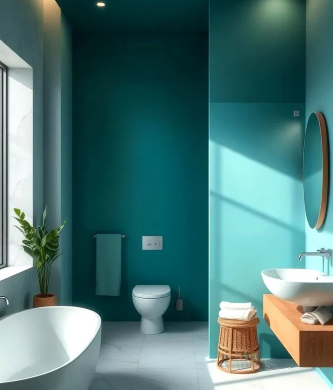
Vibrant teal blends depth with a cool modern pulse, merging oceanic calm and confident charm. This shade adds life to visuals—perfect for interiors, fashion edits, or branding that commands attention without excess. Its balance of blue and green feels fresh yet grounded.
Use teal to spark creativity and frame your projects with subtle strength. Pair it with gold, coral, or soft neutrals for striking harmony that feels current and effortlessly stylish. Pin this palette for color inspiration that stays timeless.
9. Warm Beige Essence
Warm beige carries an understated grace that feels both soft and refined. Its neutral warmth breathes calm confidence into any scene—perfect for minimal interiors, brand palettes, and lifestyle imagery that speaks quietly yet leaves a lasting note. This hue connects natural comfort with subtle luxury, creating balance without trying too hard.
Blend warm beige with muted rose, sage, or off-white for a seamless, modern aesthetic. Whether styling décor or crafting content, this tone adds harmony and depth that stands out effortlessly.
10. Deep Forest Green Mood

Deep forest green brings a grounded strength that feels earthy yet sophisticated. This shade bridges natural calm with quiet power, making it ideal for mood boards, décor palettes, or branding that values depth and authenticity. It evokes the stillness of nature while keeping an edge of modern refinement.
Pair it with muted gold, cream, or soft charcoal for a balanced, enduring look. Whether for interiors, fashion, or creative visuals, deep forest green adds character that speaks with quiet confidence.
11. Pale Lavender Grace
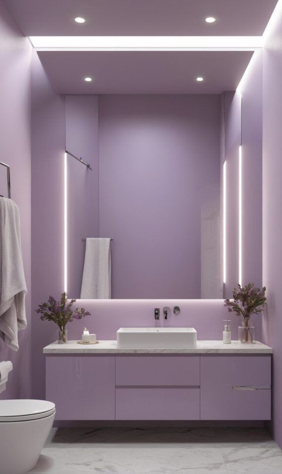
Pale lavender carries a gentle elegance, merging soft romance with calm freshness. This tone reflects quiet creativity, ideal for wedding palettes, interior styling, or branding that leans toward subtle sophistication. It evokes a light, airy mood that soothes while maintaining delicate charm.
Blend pale lavender with muted grey, ivory, or faded gold to create harmony that feels effortless yet refined. Perfect for mood boards, floral visuals, or serene lifestyle content—this shade adds poetic calm to every concept.
12. Bold Bright Sunshine Yellow

Bright Sunshine Yellow radiates pure optimism—a color that instantly lifts moods and energizes any space or design. This cheerful hue mirrors golden daylight, filling visuals with warmth, confidence, and a hint of playfulness. Perfect for catching attention on Pinterest, it sparks curiosity and encourages engagement with its glowing charm.
Paired with whites, soft neutrals, or cool blues, this color becomes a statement of joy and clarity. Whether it’s fashion inspiration, home décor, or digital branding, Bright Sunshine Yellow brings a spark of positivity that naturally draws viewers in and keeps them scrolling for more.
13. Deep Rich Navy Elegance
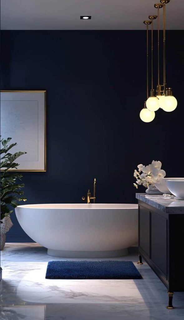
Rich Navy brings depth and composure—a shade that speaks of quiet confidence and subtle strength. Its deep tone evokes sophistication, giving visuals a refined yet modern appeal that stands out effortlessly on Pinterest boards. This color commands attention without shouting, creating a balanced sense of luxury and calm.
Pair Rich Navy with gold, ivory, or blush accents for a polished aesthetic that feels timeless. Whether applied in interior palettes, fashion edits, or brand visuals, this color communicates trust, intelligence, and enduring style that leaves a lasting impression.
14. Soft Muted Mustard Glow

Muted Mustard carries a quiet warmth—a grounded color that blends nostalgia with modern charm. Its gentle golden tone feels approachable yet sophisticated, giving visuals a cozy depth that attracts attention in a subtle way. Perfect for lifestyle, fashion, or décor content, this shade adds a refined touch without overwhelming the viewer.
Combine Muted Mustard with earthy browns, pale creams, or deep greens for an inviting palette that feels both fresh and familiar. Whether used as a background hue or accent detail, it conveys comfort, creativity, and a sense of timeless style that naturally resonates across Pinterest feeds.
15. Soft Blushing Pink Charm

Blushing Pink exudes a gentle romance that feels both graceful and modern. Its soft hue whispers warmth and tenderness, lending a delicate touch to visuals that instantly capture attention. This shade pairs emotional depth with subtle sophistication, making it ideal for lifestyle, wedding, or fashion-inspired Pinterest content.
Mix Blushing Pink with muted grays, creamy whites, or metallic accents to create a balanced and refined palette. Its quiet elegance adds harmony and approachability to designs, evoking comfort and sweetness while maintaining a polished sense of style that effortlessly draws viewers in.
Conclusion:
The bathroom color trends of 2025 lean toward calm confidence and understated luxury. Shades like Misty Sage, Clay Beige, and Soft Pewter create restful spaces that feel modern yet personal, while bolder tones such as Rich Navy or Muted Mustard bring a sense of character and depth. These hues transform simple rooms into soothing retreats with personality and charm.
Selecting the right paint isn’t just about style—it’s about crafting an atmosphere that reflects your daily rhythm. Whether your goal is serenity, sophistication, or a touch of playful warmth, this year’s trending bathroom colors offer endless ways to express individuality while keeping your space fresh and inviting.