
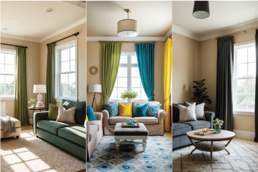
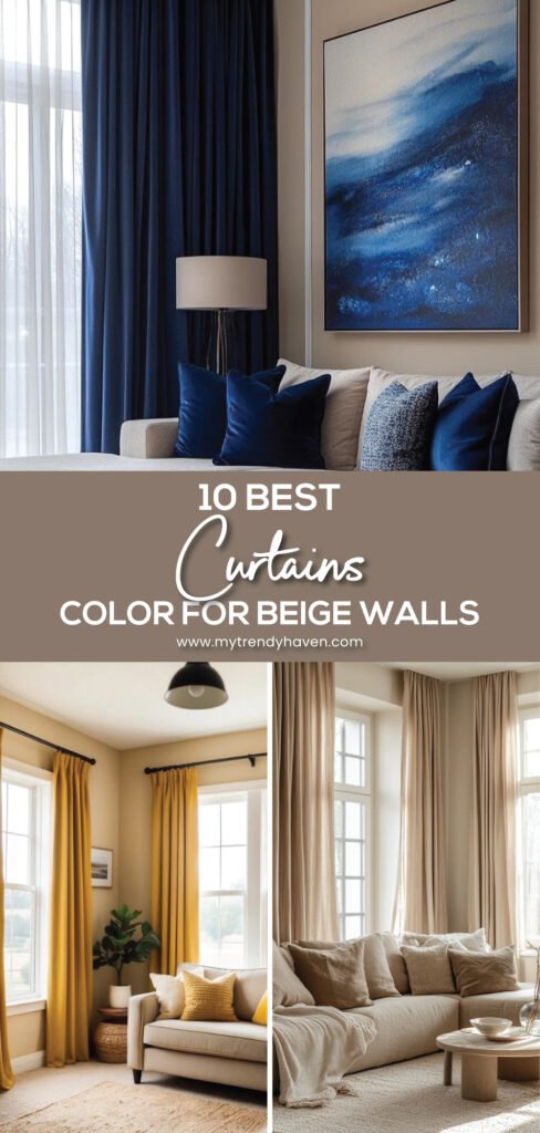
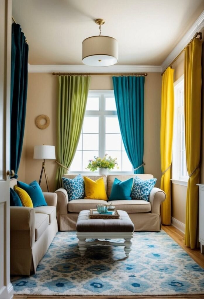
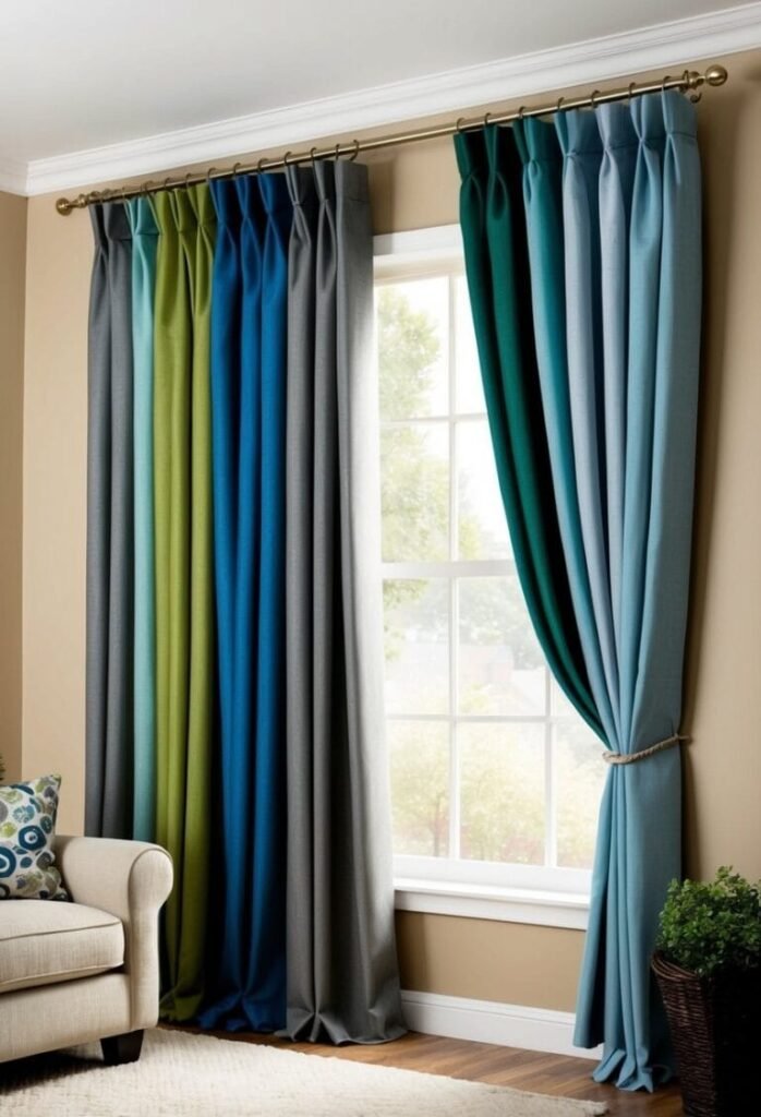
Choosing curtain colors for beige walls is about balance and style. Beige creates a neutral base, giving you the flexibility to go light, bold, or earthy with your curtain choice. Soft whites, ivory, and cream can brighten the space, making it feel open and airy. On the other hand, deeper shades like navy, charcoal, or emerald green provide a striking contrast that adds depth and drama.
If you prefer a cozy and grounded look, earthy tones such as terracotta, muted sage, or warm taupe work beautifully with beige. These shades bring warmth without overwhelming the room, while metallic or patterned accents can add a modern twist. With the right curtains, beige walls transform into a backdrop that feels polished, welcoming, and full of character.
01. Warm Taupe Color Ideas
Warm taupe is a versatile shade that blends the softness of beige with the depth of gray, creating a balanced tone that works beautifully across different styles. Its understated quality makes it a perfect backdrop for both modern and classic interiors.
In living rooms, warm taupe walls pair effortlessly with natural textures like wood, linen, or stone, creating an inviting and grounded atmosphere. Add accents in white, black, or muted greens to highlight the warmth while keeping the space visually dynamic.
For bedrooms, this shade brings calm and comfort. Layering taupe with cozy textiles, soft lighting, and subtle metallic details can elevate the room’s character without overpowering it. Whether on walls, furniture, or accessories, warm taupe adds timeless charm to your home.
02. Sage Green Décor Ideas
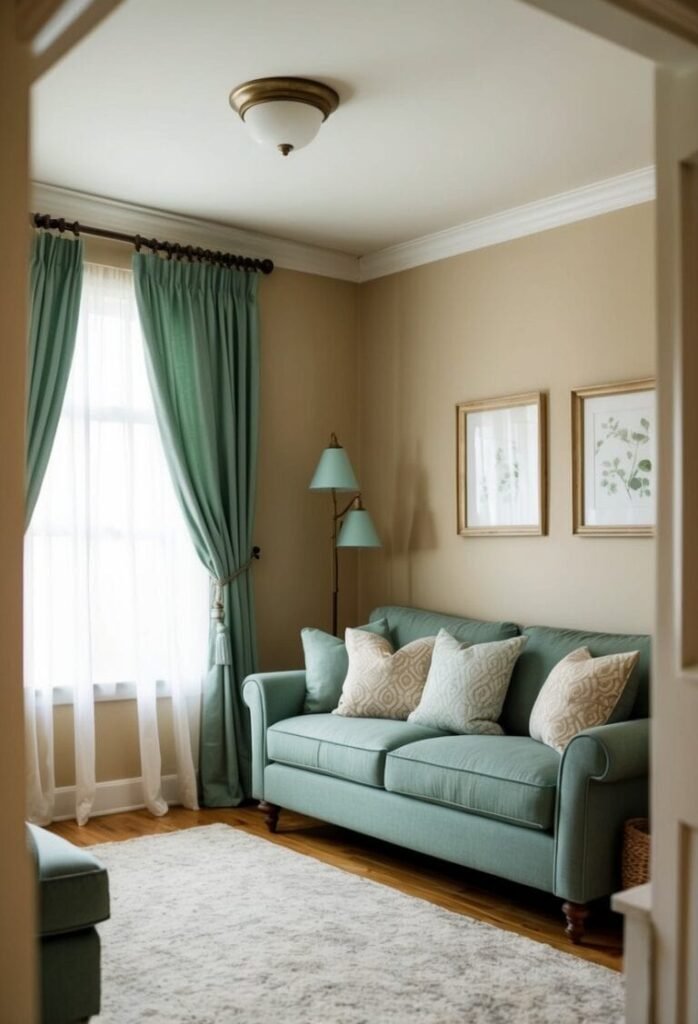
Sage green is a calm, earthy shade that brings softness and depth to any space. Its muted character makes it versatile, pairing well with both modern minimalism and classic interiors. Whether on walls, furniture, or accents, this color introduces harmony without feeling overpowering.
In living areas, sage green works beautifully with warm woods, natural fibers, and neutral shades like beige or ivory. Adding touches of brass or matte black finishes creates a refined yet welcoming look.
For bedrooms and bathrooms, sage green adds comfort and freshness. Paired with soft textiles, subtle lighting, and natural décor elements, it turns simple spaces into restful retreats. A timeless choice, sage green remains stylish year after year.
03. Dusty Rose Décor Ideas
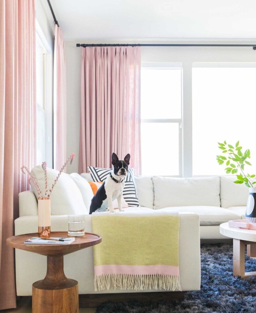
Dusty rose is a soft, muted shade that blends warmth with elegance, making it a versatile choice for interiors. Its subtle charm works in both contemporary and traditional spaces, creating an inviting atmosphere without being overwhelming.
In living rooms, this color pairs beautifully with neutrals like beige, gray, or cream. Add accents of gold, copper, or deep green for a stylish contrast that feels refined and balanced. Layering textures like velvet or linen enhances the richness of the shade.
For bedrooms, dusty rose introduces comfort and coziness. Combined with gentle lighting, plush bedding, and complementary tones, it transforms simple spaces into restful retreats. It’s a timeless color that continues to bring character and warmth into any home.
04. Pewter Color Ideas
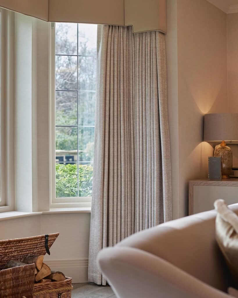
Pewter is a refined gray with subtle warmth, offering depth without overpowering a room. Its balanced tone makes it adaptable, blending seamlessly into modern, industrial, or classic design schemes. Whether used on walls, cabinetry, or accents, pewter adds understated sophistication.
In living spaces, pewter pairs well with soft neutrals like ivory and beige, while also complementing darker shades such as navy or forest green. Metallic finishes like brushed nickel or brass bring contrast and texture, enhancing its timeless appeal.
For bedrooms and offices, pewter creates a calm yet polished atmosphere. Layering with cozy fabrics, natural wood, and thoughtful lighting completes the look, making the space feel inviting and well-rounded. It’s a versatile shade that continues to stand the test of time.
05. Navy Blue Aesthetic Ideas
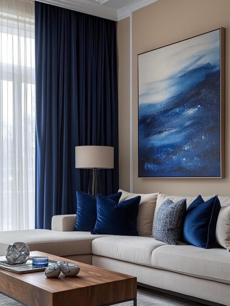
Navy blue adds instant depth and style to any project. From home accents to fashion choices, this deep shade blends effortlessly with neutrals or metallics, creating a polished and timeless feel.
In décor, navy works beautifully for walls, furniture, or statement pieces. Pair it with crisp whites for a clean look or add warm wood tones for balance. Small touches—like throw pillows or art—make a big impact without overwhelming a space.
For style, navy is a versatile choice that flatters all seasons. Whether in outerwear, casual fits, or accessories, it feels sophisticated yet easy to wear. Its adaptability makes it a staple color to revisit time and again.
06. Mustard Yellow Ideas
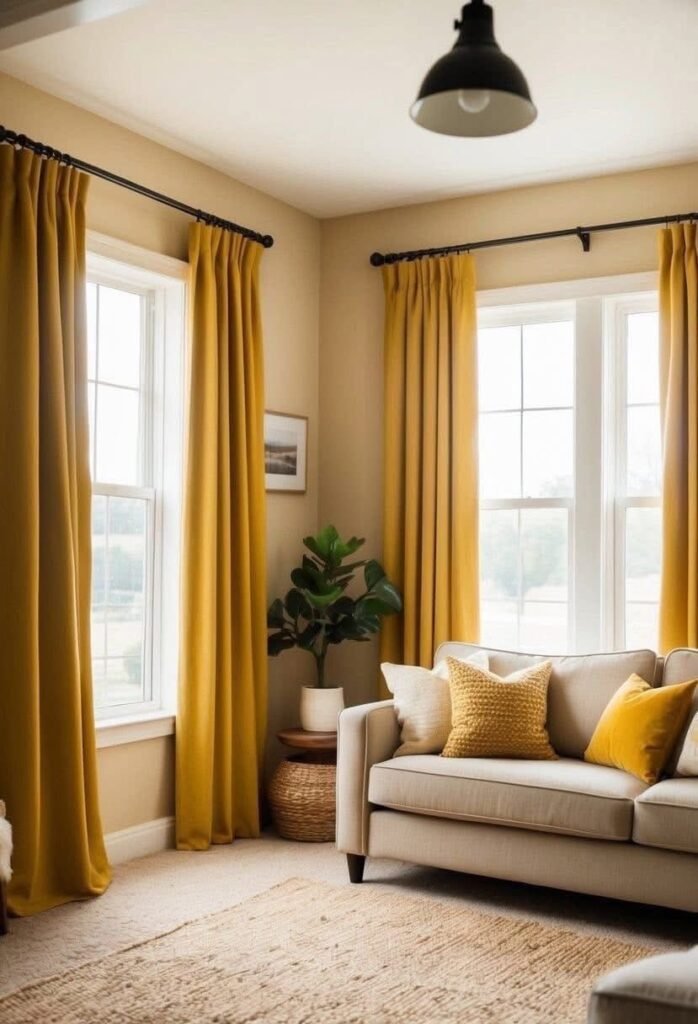
Mustard yellow brings warmth and bold energy to any setting. Its golden undertones make it a striking accent color for style, design, or creative projects, giving spaces and outfits a lively character.
In interiors, mustard yellow works beautifully on cushions, rugs, or feature walls. Paired with grey, navy, or natural wood, it creates a cozy yet modern look. Even small pops of this shade can brighten a room and add instant personality.
In fashion, mustard yellow adds flair to seasonal wardrobes. Whether layered in outerwear, used in accessories, or styled with neutrals, it delivers confidence and a fresh twist to everyday outfits.
07. Terracotta Style Ideas
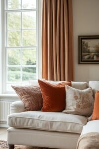
Terracotta brings earthy warmth and grounded charm wherever it’s used. This clay-inspired shade feels natural yet refined, making it a favorite for both design accents and everyday styling.
In interiors, terracotta works seamlessly on pottery, textured walls, and soft furnishings. Combine it with beige, cream, or olive tones for a cozy palette that feels balanced. Even subtle additions—like vases or throw blankets—can reshape a room’s character.
In fashion, terracotta adds depth and richness. From casual wear to statement accessories, it pairs well with neutral tones and metallic highlights, giving outfits a bold yet approachable feel throughout the seasons.
08. Charcoal Gray Ideas
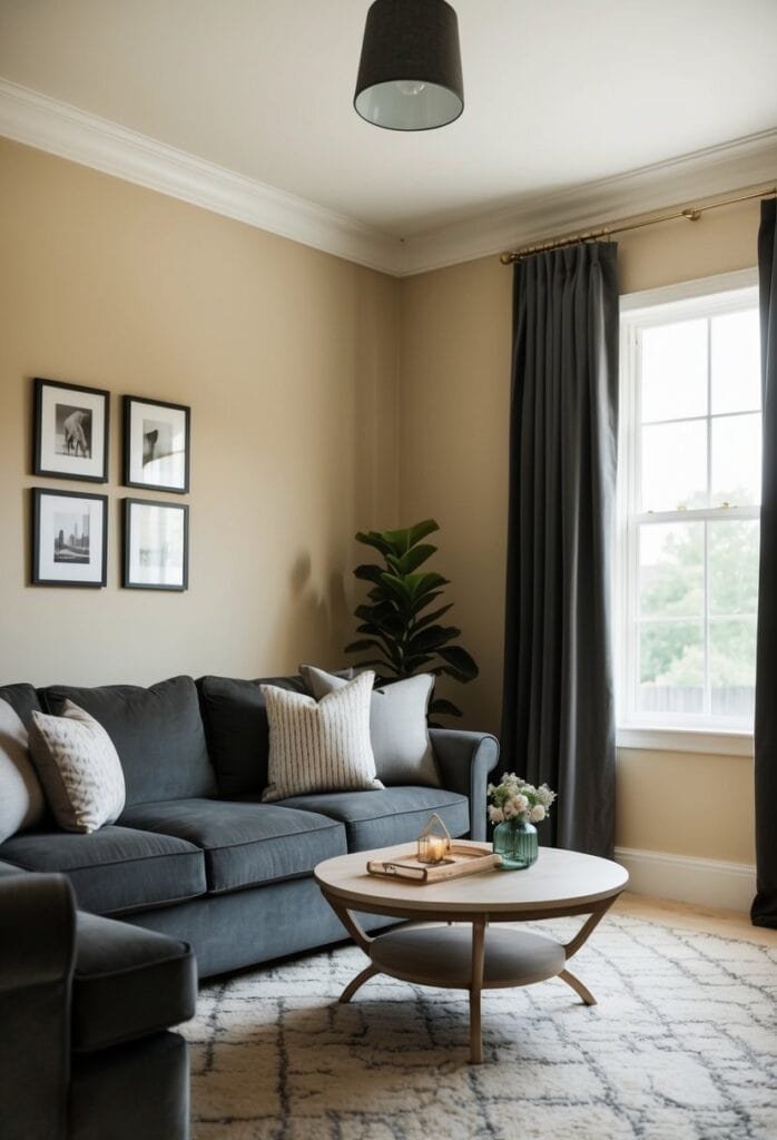
Charcoal gray delivers a strong, timeless presence that balances sophistication with versatility. This deep neutral shade works well in modern settings, offering a sleek backdrop or a standout detail depending on how it’s used.
For interiors, charcoal gray suits furniture, accent walls, and decorative elements. Pair it with crisp whites, muted pastels, or metallic finishes to create contrast and dimension. Even small touches—like cushions or framed art—can give a space renewed character.
In fashion, charcoal gray is a dependable color that transitions smoothly across seasons. Whether in outerwear, workwear, or accessories, it conveys elegance while remaining easy to mix with brighter tones for balance.
09. Olive Green Style
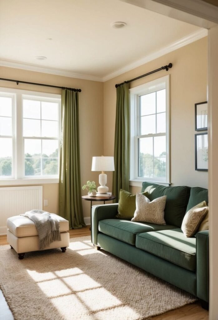
Olive green brings a natural balance that feels grounded yet stylish. This earthy shade works across fashion, décor, and creative projects, adding depth without overwhelming a palette.
In interiors, olive green shines through painted walls, textured fabrics, or accent décor. Pair it with cream, terracotta, or wood elements for a cozy look. Even subtle touches—like planters or throw cushions—can shift the tone of a room.
In fashion, olive green is adaptable across seasons. From outerwear to casual layers and accessories, it blends effortlessly with neutrals or bold shades, creating looks that are both polished and approachable.
10. Teal Inspiration
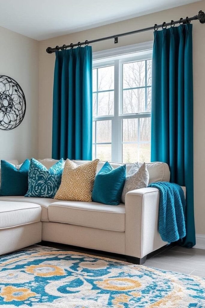
Teal blends the calming tones of blue with the richness of green, creating a color that feels fresh yet grounded. It’s a versatile shade that can be bold or subtle, depending on how it’s used.
In home design, teal works beautifully on walls, accent furniture, or soft furnishings. Pair it with neutral shades, metallic accents, or warm wood textures to strike a balanced look. Even small touches, like vases or cushions, can make a space feel more inviting.
In fashion, teal adds character to seasonal outfits. Whether in dresses, outerwear, or accessories, it complements both muted and bright shades, offering an elegant yet approachable style choice.
Psychology of Color
Color affects more than style—it influences emotions, energy, and how a space feels. The right choice can make a room feel energizing, soothing, or balanced, depending on the shades you bring in.
Warm hues like red, orange, and yellow can spark energy and create a welcoming feel, perfect for lively spaces. Cool tones such as blue, green, and soft lavender, meanwhile, promote calm and are well-suited to restful areas like bedrooms or baths. Even neutrals—grays, creams, and whites—offer a steady sense of ease.
You can also use color to shape perception. Bold curtains or accents draw the eye upward, giving smaller rooms a sense of openness. Darker tones can make larger areas more intimate. By understanding how color affects mood, you can shape spaces that are both visually appealing and emotionally supportive.
Styling Beige Walls
Beige walls offer a neutral foundation that works with countless design styles. Their warmth makes them adaptable, allowing you to mix contrasting tones or keep things soft and cohesive. The key is finding the right accents to bring out their character.
Balancing warm and cool shades creates interest. Pair beige with deep blue or charcoal gray for striking contrast, or add burgundy and mauve for depth that feels inviting. Metallic finishes, like silver or chrome, can reflect light and bring a touch of polish to the room.
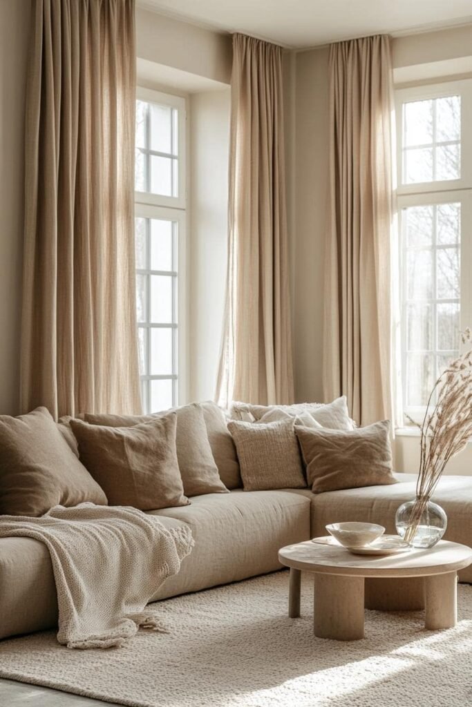
For a more unified palette, lean into lighter tones such as cream or natural linen. These shades amplify the welcoming quality of beige while maintaining elegance. Neutrals like sheer white or burlap curtains keep the look simple, letting textures and subtle patterns provide variety without overwhelming the space.