
The front door is the first thing people notice about a home. It gives a message before anyone even steps inside. A good color choice can make the entrance warm, bold, or peaceful. The right shade adds personality, matches the house style, and even lifts the mood of the people living inside.
A painted front door does more than look pretty. It protects the wood, hides wear, and makes the whole house feel refreshed. The tricky part is picking the right color. Some shades feel calm. Some look dramatic. Others add energy or elegance.
Here are 14 front door color ideas explained in detail.
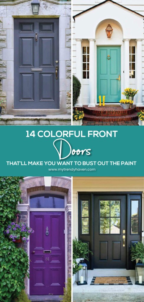
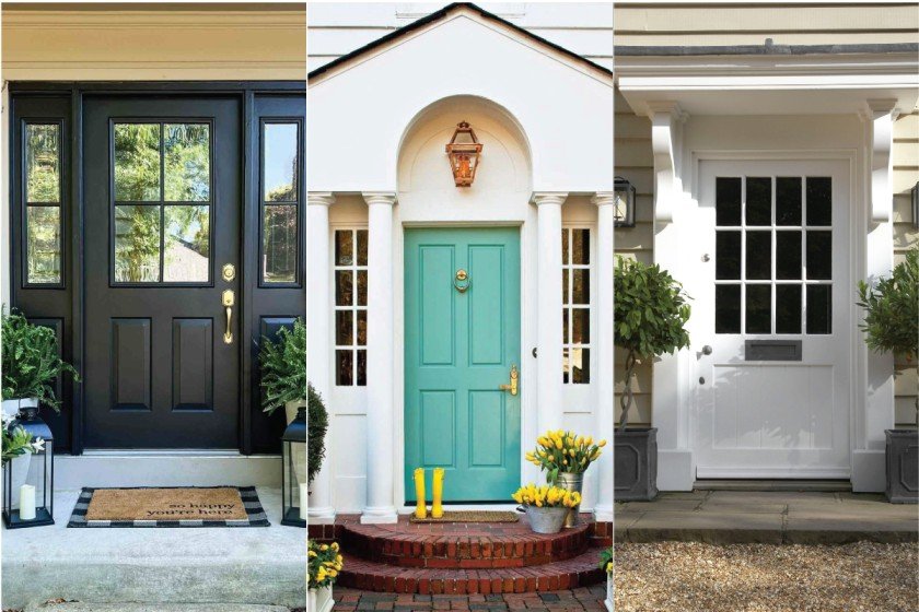
1. Classic Black
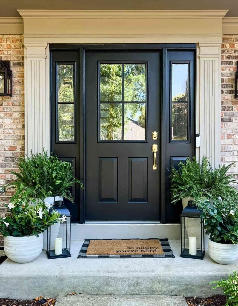
Black never loses charm. It always looks smart and confident. A black front door suits almost every home style, from a brick colonial to a modern townhouse. The color gives a sense of strength and safety.
Pair black doors with white trims for a crisp, bold contrast. On gray siding, black doors add depth and style. Brass or gold hardware shines against the dark shade, making the door feel rich. For a modern home, use silver or matte black handles for a sleek finish.
Black paint also hides dust and small scratches better than lighter shades. A semi-gloss finish works best since it reflects light but is easier to clean than high-gloss.
Black doors are especially popular in city homes where sophistication is key. They also look stunning when paired with a checkered tile porch or lantern-style lighting.
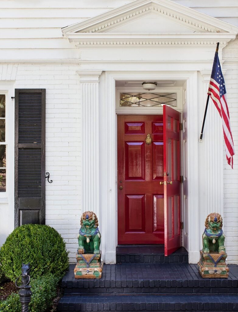
2. Bright Red
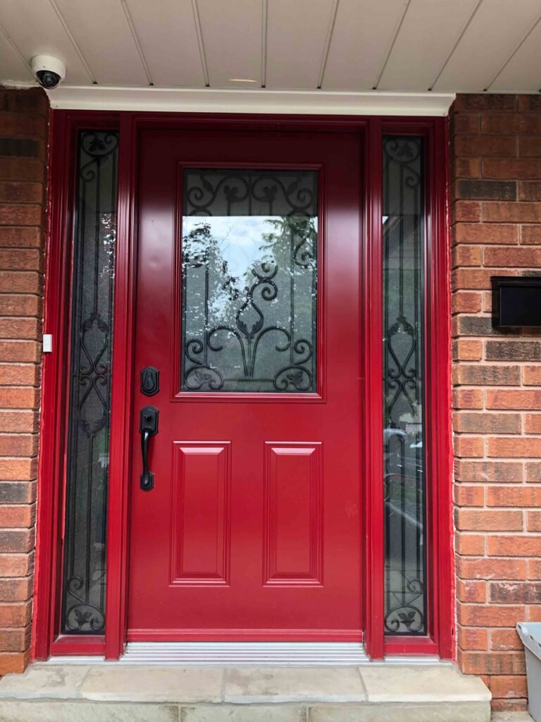
Red doors are filled with energy. Many cultures see a red door as a symbol of good fortune and a warm welcome. It feels bold, cheerful, and full of life.
This shade works well on white clapboard houses, beige siding, and red brick homes. For trims, use white or cream so the door stands out. A glossy red finish adds shine, while a matte red looks rustic and cozy.
Brass knockers, black iron handles, or bronze fixtures complement red doors beautifully. Potted plants with green leaves or white flowers make the entrance feel balanced.
Red works best in areas where winters are long or skies are often gray. It adds warmth and brightness against dull weather.
3. Deep Navy Blue
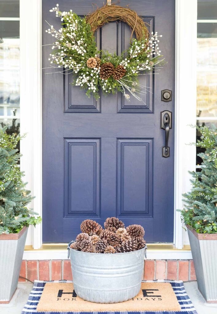
Navy blue feels calm yet powerful. It’s not as heavy as black but still adds depth. Navy is a great choice for coastal homes, cottages, and even modern designs.
Pair navy with white siding for a nautical look. It also works well with light gray, cream, or stone exteriors. Silver or chrome hardware looks clean and stylish. For a classic touch, add brass accents.
Navy paint hides dust and dirt well, making it practical for busy streets. It also works in all seasons – fresh in summer and rich in winter. A navy door with a glass window panel can soften the heavy tone.
4. Fresh Green
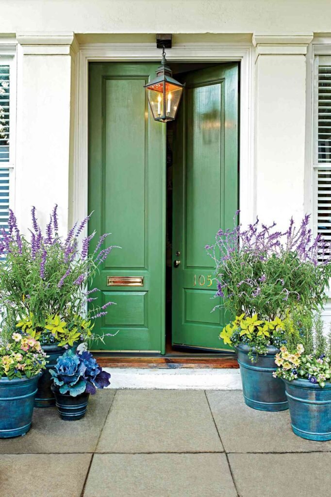
Green connects the home with nature. It feels peaceful and full of life. A green front door can range from light sage to deep forest tones.
Light green shades feel playful and inviting. Dark greens look elegant and traditional. Pair green with stone or wooden siding for a natural match. White trims highlight the freshness of the shade.
Plants around the entryway work perfectly with a green door, creating harmony. Brass or black handles look strong against dark green, while silver hardware pairs well with light tones.
Green doors are also known for symbolizing growth and renewal, making them a meaningful choice.
5. Warm Yellow
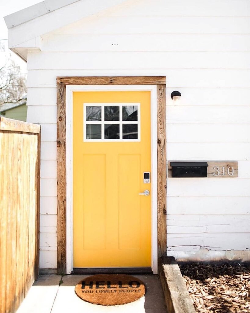
Yellow brings joy right to the doorstep. It makes the entrance look sunny, even on cloudy days. A yellow door signals happiness and positivity.
Lighter yellows feel gentle and soft, while bold mustard or golden shades feel modern. Pair yellow doors with white or gray walls for balance. On brick houses, a yellow door adds a surprising pop of cheer.
Black handles or knockers add contrast and prevent the door from looking too pale. Plants in terracotta pots work beautifully with yellow since they echo warm tones.
The downside is that yellow shows dust more easily, so regular cleaning is needed. Still, the happy glow is worth the care.
6. Rich Burgundy
Burgundy feels elegant and classic. It’s a deep red with a touch of purple, which makes it sophisticated.
This shade looks amazing on brick homes, cream siding, or stone walls. Bronze, gold, or brass hardware pairs beautifully with burgundy. Add lantern lights or a brass door knocker to complete the look.
Burgundy gives a home a warm and welcoming vibe without being too bright. It suits traditional houses, country homes, and even modern builds with neutral exteriors.
The darker shade also means less cleaning compared to lighter doors. It’s both stylish and practical.
7. Crisp White
White front doors feel fresh and clean. They brighten the entrance and reflect sunlight, which makes small porches feel bigger.
White pairs with nearly every house color – red brick, blue siding, or even dark gray walls. For a farmhouse style, use matte white paint with black iron handles. For a modern feel, pick glossy white with silver hardware.
White does need more cleaning since dust and marks show quickly. A semi-gloss finish makes wiping easier. Despite the extra care, the timeless look is always worth it.
Lighting also plays a big role. Warm porch lights make a white door glow, while cool lighting keeps it crisp and modern.
8. Earthy Brown
Brown feels natural and warm. It gives the home a grounded and secure look. Wooden doors stained in rich brown tones often feel more luxurious than painted ones.
Darker browns feel elegant and polished, while lighter tones give a rustic, farmhouse charm. Brown doors look amazing on beige or stone siding. Brick homes also suit brown doors because the tones blend well.
Use bronze or black handles to complete the look. Add a wooden bench or a coir doormat to highlight the natural vibe.
Brown doors also hide dirt well and age beautifully. As wood weathers, it often develops a character of its own.
9. Bold Orange
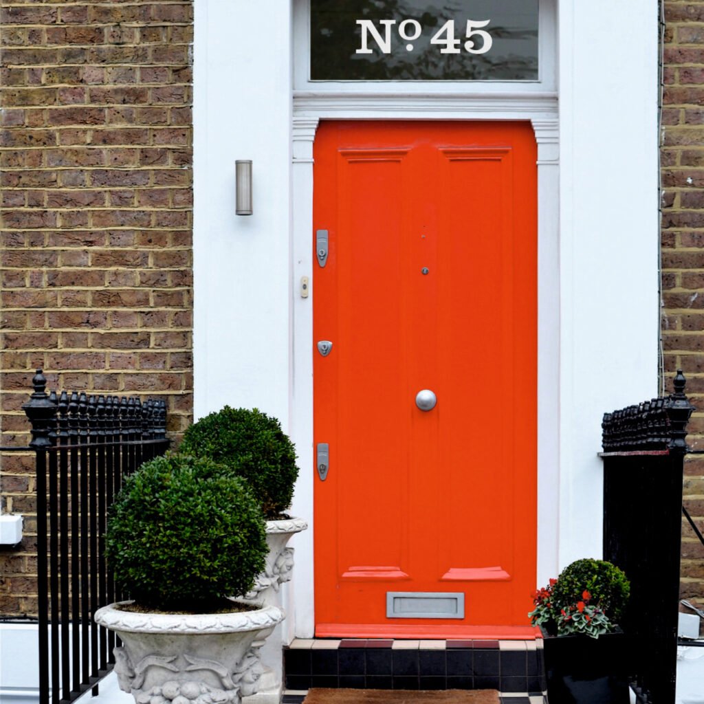
Orange feels creative and bold. It adds personality and makes the house stand out instantly.
A soft peachy orange feels friendly and cheerful. A burnt orange gives warmth and depth, working well with autumn leaves. Pair orange with white or gray siding for balance. Black hardware tones down the brightness, while silver adds sparkle.
Plants with green leaves look great near orange doors since they contrast well. For a more stylish look, use geometric house numbers or modern lights.
Orange doors are less common, so they make a unique statement without looking too unusual.
10. Soft Gray
Gray feels calm, neutral, and modern. It blends in easily yet still looks stylish.
A light gray door feels fresh and simple, while dark gray adds strength. Pair gray with white trims and black handles for a sharp contrast. Gray also looks great with stone walls or glass paneling.
Gray doors are easy to maintain since they hide dust well. Matte gray feels rustic, while glossy gray adds a sleek touch.
This shade is ideal for homeowners who prefer a modern but understated look.
11. Elegant Purple
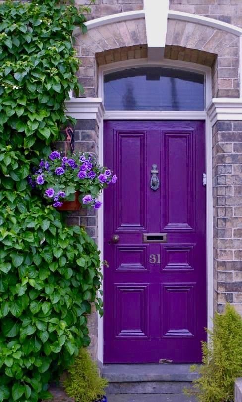
Purple adds a touch of mystery and style. Light lavender feels gentle and romantic. Deep plum feels rich and dramatic.
Purple works well with cream or beige siding. On stone homes, it looks bold and striking. Pair it with silver handles for a chic style or with brass for warmth.
A purple front door shows personality and creativity. It makes a home look unique without being too bright or overpowering.
For a cozy entrance, add lanterns or hanging plants to soften the dramatic tone.
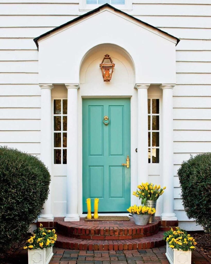
12. Calm Teal
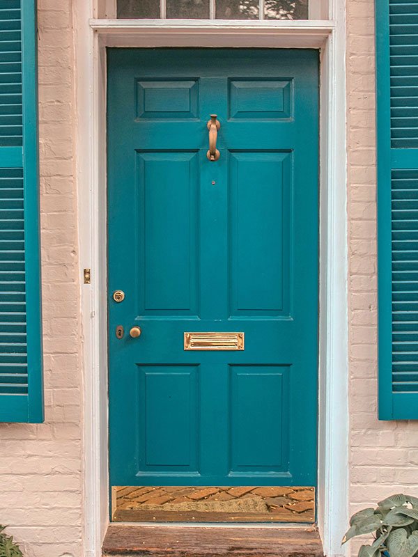
Teal blends the calm of blue with the freshness of green. It feels cool, soothing, and balanced.
Light teal shades feel beachy, while darker teal looks elegant. Teal works well on white, beige, or stone walls. Silver or chrome hardware pairs perfectly, while black handles add contrast.
Plants with white or yellow flowers look lovely near teal doors. Glass paneling on teal doors adds extra charm and light.
Teal also ages well, staying fresh across all seasons. It feels cheerful in summer and rich in winter.
13. Bright Turquoise
Turquoise feels joyful and bold. It reminds people of ocean water and clear skies.
This color works beautifully in coastal areas or sunny neighborhoods. On white or light gray walls, turquoise looks playful and striking. Pair it with silver hardware to keep it modern.
Turquoise works well with plants, especially succulents or tropical leaves. It can also be softened by using natural wood furniture around the porch.
Though bright, turquoise makes the home feel lively and full of personality.
14. Modern Charcoal
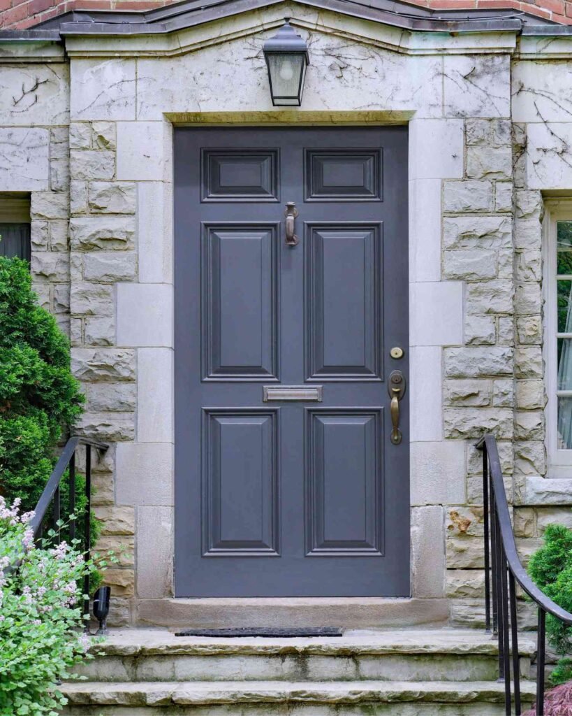
Charcoal is dark, but not as intense as black. It feels modern, sleek, and elegant.
Charcoal pairs with white siding for contrast, or with light gray for a layered look. Silver or matte black hardware blends well with this shade.
Charcoal doors are low-maintenance since dust and dirt do not show easily. A satin finish looks best as it gives depth without too much shine.
Lighting plays an important role. Warm yellow lights make charcoal look softer, while white LED lights highlight its sharpness.
Conclusion
A front door color sets the mood for the whole house. Each shade brings a different feeling. Black, gray, and white bring elegance and timeless style. Red, yellow, and turquoise add energy and cheer. Green, brown, and burgundy connect with warmth and tradition. Teal and purple bring creativity and uniqueness.
The best choice depends on the house style, personal taste, and the message you want your home to give. A painted front door not only adds charm but also shows personality.
Pick a shade that makes you feel proud every time you step inside. That small change can make a big difference in how the home feels.